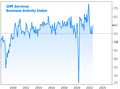
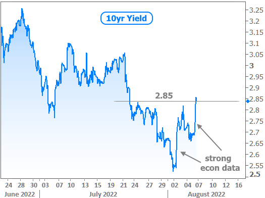
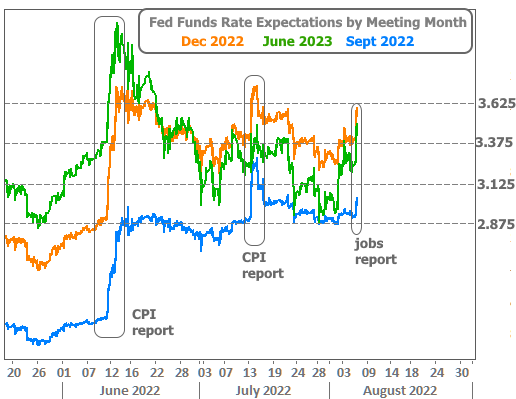
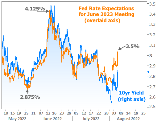
The big monthly jobs report from the Labor Department (officially “The Employment Situation) is one of the most reliable sources of volatility for interest rates. While this was much easier to observe before the pandemic, key economic reports have been getting more and more attention as the market looks for evidence that inflation and tighter Fed policy are taking a toll on the economy. A weaker economy creates less demand for goods and services. This serves two purposes for interest rates. Lower economic growth increases the appeal of safer haven investments like bonds. Excess bond buying demand pushes rates lower. Lower demand can help prices fall, thus helping to cool inflation. Inflation is an enemy of low rates, and a key reason for the tighter Fed policy that’s keeping upward pressure on rates. So if inflation subsides, rates would move lower, all other things being equal. All that to say: what’s bad for the economy is usually good for rates. Several recent reports have indeed shown clear signs of economic contraction. This is a key reason that rates hit new long-term lows last week. But this is a new week, and the two biggest economic reports were anything but weak. Swinging for the fences. On a week where many sports fans thought fondly of the late Vin Scully’s famous “high fly ball into right field” call during the 1988 World Series, two of the heaviest hitting economic reports were also swinging for the fences. First up was the mostly highly regarded index on the services sector (ISM’s Non-Manufacturing PMI). It painted a picture of an economy that was anything but contracting in July. Especially notable was the “business activity” component of the data, which hit its best level of 2022. More importantly, it provided stark contrast to the last 2 readings that were some of the worst in more than a decade (lockdown months notwithstanding). And how about that big jobs report? After last month’s report showed 372k jobs created, the median forecast for the July numbers (released this week) was only 250k–a veritable strike-out relative to the last few reports. But the payroll count connected in a big way, coming in at 528 with an upward revision to 398k for June. Wage growth also beat expectations of 0.3%, coming in at 0.5%, also with an upward revision to June’s number. To reiterate, strong economic data is bad for rates, and these two reports were very strong. Together, they served as a one-two punch that brought 10yr yields and mortgage rates back up to last week’s highs.  Higher mortgage rates? What about 4.99%?!News stories ran wild with headlines proclaiming the abrupt return of sub-5% rates on Thursday. Regular readers know that’s old news considering our discussion about the availability of even lower rates last week. So what’s up with this week’s news? As with so many instances of frustrating mismatches between the average news headline and actual mortgage rate availability, this one also occurred due to over-reliance on Freddie Mac’s weekly mortgage rate survey. Freddie’s survey is the longest-running, most deeply entrenched catalog of historical mortgage rates in the industry. It became entrenched for a reason, and it does a fine job of tracking broad changes over time–especially in the absence of much volatility. But for the purposes of understanding where rates are on any given Thursday, the Freddie survey is unacceptably stale–especially during times of heightened volatility. Why is it so stale? The survey’s official response window runs Monday through Wednesday, but a vast majority of the responses are in by Monday. Freddie officially states that most responses are received on Tuesday, but this is either not true or those responses are coming in early Tuesday morning before lenders update their rates for the day. If there was ever a report that confirmed it, it’s this week’s! Here’s why: The chart above shows minute-by-minute movement in mortgage-backed securities, the raw ingredients that dictate the rates that can be offered by mortgage lenders (for those familiar with MBS prices, the line above has been inverted so it moves higher with higher rates and vice versa).In short, this week’s survey window fell at the absolute bottom of this week’s rate range (a bottom that only lasted hours). Moreover, it was measured against the absolute top of last week’s range, thus making for the biggest possible week over week drop that could have been captured.None of the above is bad in and of itself. If rates hadn’t moved much after Tuesday morning, 4.99% would be close enough to reality–especially after factoring out the additional upfront costs (i.e. “points”) included in the survey. But as we know–both due to the chart above and the initial look at the economic data reaction, rates had risen significantly by Friday. Bottom line on rates: Rates WERE much lower earlier this week, but quickly returned to the levels in line with last week’s highs. Incidentally, Freddie was going to catch a break due to a solid performance by the bond market on Thursday, but Friday’s jobs report completely erased that improvement (hence the “W” pattern in daily rates below)  Eternal disclaimer on rate indices: There are always multiple factors that can affect any individual rate quote. Broad indices like Freddie’s weekly mortgage rate survey or the “actual daily average” above are distilled from best-case scenarios–at times with a certain amount of upfront cost (“points”) implied. Additional disclaimer on “points”: A “point” is a term for 1 percentage point of a loan balance paid upfront in order to obtain a lower rate. This additional cost isn’t always 1 exact point. It can be more or less. But the point about these points at this point in mortgage rate history is that they are packing a much bigger punch than normal. Mortgage Rates Are Dropping at a Record Pace” We talked about why last week, but the bottom line is that there’s really not nearly as much difference between a mortgage rate of 4.99% and 5.5%+ as history would suggest. In the past, those two rates would typically be separated by at least 2 points. At present, it’s less than 1 in most cases. This not only makes for more volatility in day-to-day rate tracking, but it also means that rate quotes are more diverse as some lenders advertise with points while others do not. Coming up next week: If a strong jobs report gave us something to talk about this week, understand that the jobs data hasn’t been remotely as relevant as the Consumer Price Index (CPI) as far as bonds and rate expectations have been concerned in the past 2 months. Need proof? Eternal disclaimer on rate indices: There are always multiple factors that can affect any individual rate quote. Broad indices like Freddie’s weekly mortgage rate survey or the “actual daily average” above are distilled from best-case scenarios–at times with a certain amount of upfront cost (“points”) implied. Additional disclaimer on “points”: A “point” is a term for 1 percentage point of a loan balance paid upfront in order to obtain a lower rate. This additional cost isn’t always 1 exact point. It can be more or less. But the point about these points at this point in mortgage rate history is that they are packing a much bigger punch than normal. Mortgage Rates Are Dropping at a Record Pace” We talked about why last week, but the bottom line is that there’s really not nearly as much difference between a mortgage rate of 4.99% and 5.5%+ as history would suggest. In the past, those two rates would typically be separated by at least 2 points. At present, it’s less than 1 in most cases. This not only makes for more volatility in day-to-day rate tracking, but it also means that rate quotes are more diverse as some lenders advertise with points while others do not. Coming up next week: If a strong jobs report gave us something to talk about this week, understand that the jobs data hasn’t been remotely as relevant as the Consumer Price Index (CPI) as far as bonds and rate expectations have been concerned in the past 2 months. Need proof? The chart above is a bit busy, but the goal is to show CPI’s power to move both shorter and longer-term rate expectations more readily than the jobs data. Need proof that rates like 10yr Treasury yields are moving in concert with longer-term Fed rate hike expectations? (there is no dedicated axis for the orange line below, but the annotations show the relevant peaks and valleys The chart above is a bit busy, but the goal is to show CPI’s power to move both shorter and longer-term rate expectations more readily than the jobs data. Need proof that rates like 10yr Treasury yields are moving in concert with longer-term Fed rate hike expectations? (there is no dedicated axis for the orange line below, but the annotations show the relevant peaks and valleys):  All that to say “CPI matters.” Next Wednesday (August 10th) brings one of the two instances of CPI data that the Fed will get to consider before deciding on a rate hike path at the September meeting. There will be other economic data as well, but none of it will have as much potential to cause a stir–for better or worse. All that to say “CPI matters.” Next Wednesday (August 10th) brings one of the two instances of CPI data that the Fed will get to consider before deciding on a rate hike path at the September meeting. There will be other economic data as well, but none of it will have as much potential to cause a stir–for better or worse.Josh Spiegel MLO, Integrity Mortgage P: (317) 588-3810 M: (317) 513-3306 www.imgindiana.com/josh-s… 410 W Oak St Suite 8B Zionsville IN 46077 License: NMLS: 1750676 |
